Friday, April 30, 2010

PARK DESIGN HOUSE Minimalist

Minimalist garden design

How minimalist design for the home garden?
Park home owners increasingly become the status symbol. Mix & match style house with a garden can produce a unique look and increasingly reflects the owner.

At present, the park houses not only as a mere supplement, but it's getting just as important as architecture and interiors. Even for some people has become a symbol of prestige. The better someone's home garden arrangement, reflecting the social class of owners.

Park in your house. Same personal with home design. It is expected that the design reflects not only personal but also supports the home owner activity and the needs of residents of the space. From the head of the family, wife to the kids.

For example, one of the lifestyle trend now is to hold a garden party with a barbeque in the evening or late afternoon. Of course, we will gladly run this program when we garden with good design, especially at night.

If we have children who are active. Obviously need a roomy place to play. Garden elements such as swings and play ground equipment that other children can we match the garden design.

Certainly many aspects that must be taken into account in designing the park. Although we do get help from the landscaper, still we must pay attention to the important aspects in the design of the park, namely: expansion of existing parks, activities shall be accommodated in the park, the harmony of gardens with buildings.

Like architecture, garden design known in a variety of gardens. What is the type of garden? There are various types of parks are generally known. Distinguished by the cultural background and geographical origin of the development of the park. Differences in composition and animating characters that used the park.

There are so many types of garden that a traditional cultural background and geographical. There's Japanese garden, china garden, garden french, American, English, tropical Bali, a tropical Thailand and Japan, there is a growing garden suitable times, such as garden modern, minimalist and dry garden. Each type reflects a strong character and have different effects lover.

That one architectural style developed today are minimalist. This style emerged after World War II. Nowhere on Those days lots of people's houses destroyed by the war so That the government make a home in modular form (Standard and Poor 'in Aceh now), WHO is easy and cheap workmanship but still with the design well. Key features of this building is a simple form, without ornament and emphasis on function space.

Simple and without ornament is suitable to the spirit and lifestyle during this period. Simple and emphasis on function. Unfortunately in Indonesia, this minimalist style so expensive because it is not made of modules that are available and must be custom made.

Distinctive minimalist building is at least ornament and color who tend to be styled 'industry' is a white, gray and black.

Houses do not have minimalism minimalist garden as well. Mix & match (solid-match) of the various garden-style residential homes can make you look more stylish.

Tuesday, April 27, 2010

Minimalist Design Style House Widely Used


Architect Design minimalist house developed very rapidly in recent years. We met many people who wanted to use a minimalist style to follow fashion. Usually those who like to force the youngsters, an executive with a dynamic lifestyle, urban lifestyle, and all kind of simple, neat and elegant and this express themselves.

very clear and nothing wrong if the force is not only one of the main architectural styles, but also answers the times are getting "the most out of something at least." These funds may be construction of a minimal, or even a lifestyle that is minimized. various reasons ejected, this force was used because of limited funds, but it can still be reversed limitations of trend following. yes legitimate reason, but there is another sniper stance-a stance that could reduce the cost to be affordable.

Check out the look of the Home Design Minimalism without excessive ornamentation, no trinkets, wearing materials exposed impressed with what is "honest" in appearance, not "lebay". Bak is an executive job with the look of a clean, neat, elegant, practical and express themselves, and for many people this is fun.

There is a reason that this style is one of the main form of protest by the followers understand minimalism on the exploitation of natural resources in an all-out used in vain. There is also that suggests that this "back to basic" because when the incidence in the United States is considered a very positive of a modern movement.

modern office furniture – best suited for modern business works


This is modular office furniture design to decor your interior home office design with minimalist and modern styles. Modular furniture is the perfect solution for the changing needs of your office. Computer furniture has increasingly become trendier and contemporary to blend into the décor of your office or home office. Modular sets of modern home office furniture usually include a desk, office chair, and some form of storage unit.

Monday, April 26, 2010

Tropic Minimalist Home Design Architecture in Indonesia


Tropic Minimalist Home Design Architecture in East Java, Indonesia

The architectural design minimalist house at home is not difficult as the size. We can make some small areas look even bigger then actual size. In Malang, East Java, Indonesia, several small houses adapt to minimize the architectural design tropical house. It uses some of gardening, wall color composition, texture and some home decor.

Minimalist House Design

Minimalist home decor could use some elements such as the use of a small gate, textured floors and gardening. minimalist home architecture design is not really good in the tropical climate. The cause of the high temperature makes the house hotter than a bigger house. But, if the small house architectural design to adapt good air circulation, it will affect the heat problem.

architecture necessary for a small area of the house. It can explore a small area appear larger than it is real.

Sunday, April 25, 2010

Simply Elegant Minimalist Home Design

Simply Elegant Minimalist Home Design

Only a few plans to start building a house of minimalist elegance. We started small so that we can focus on quality. As we grow our commitment is to always represent the only plan that offers high-quality design inside and out. Architectural styles we offer will usually be a modern, livable house interpretation of American Classics. Unique house plans and sophisticated yet simple design of the house like Country, Craftsman, Bungalow, Shingle Style, Cape Cod, Cottage, Colonial and Farmhouse. Can not find the plan you're looking for? Please drop us a note with your suggestions or our custom design one for you.

Saturday, April 24, 2010

Creating a Minimalist Home Design That Embodies "The Luxury of Enough"

Why Houses Minimalist
Creating a minimalist home design that embodies "the luxury of enough" | Minimalist House Design

Why Houses Minimalist?
Many Americans long for a simple life and there are so many books and guides to help us find it in their daily routine and in the workplace. However, most of us are unpracticed in explaining to others (or even ourselves) what a simple house or a minimalist for a truly life would look like. We feel that there is something missing in our hurried routines, but we do not know where to start editing the complexity.

In my book, we began a simple exploration of the 21 homes across the country and the experiences of people who built them. The houses and their owners travel offers an interesting counterpoint to the way most people buy a new home developers in the market today.

Pathways to Home Search
21 houses are arranged in six lines that people use simple ask what really matters to them well in their lives and homes. Ranging from saving for flexibility in design, this track can help you consider your own home and how to simplify it. Roads are as follows:

Simple and minimalist design of the house is enough - A house is minimalist and simple is a positive affirmation of "the luxury of simply" By this we mean that a simple home design begins with finding out how much you really need and what you can eliminate .. Luxury of sufficient means to face the fact that you really do not need eight-burner stove and a larger kitchen for the house. Forty years ago, the utility used to be a bad word in home design. In the 1950s rambler, the utility room is not really a showplace for our guests. But today, many utilitarian buildings such as warehouses and an old barn, is a highly desirable location for new housing and work space. They are designed for pure function for storage and industry, but this time they worked brilliantly for the open-plan living. They offer the luxury of living in a world apart.

simple, minimalist home is often a rectangular, sometimes square, and was always "enough," whether in terms of dormers, the number of bathrooms, or square recordings. At this point, we visit homes that reflect their owners choosing to live instead of images they want to present to the street. This design for "adequate" appear deceptively simple because they really grew out of a lot of careful decision making.

Wednesday, April 21, 2010

Minimalist House Plan Design by Craftsman


Simple and minimalist design house plans directly from the many houses have been built.

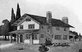
This has been one of the most popular of the Craftsman home design and shown here has been slightly modified from the plan first, modifications and improvements that have been suggested by different people who have built homes, so they are all very valuable as a result of practical experience. Although the picture shows the patch walls and foundations of field stone, the design lends itself quite as easily to a wall of brick or stone, or even for shingles or clapboards, if a wooden house as desired.

Outside the kitchen at the back is only recommended if the house built in this country, because in that city would not be necessary. In such a farmhouse outside the kitchen because it affords the easiest place for outdoor work such as laundry and ironing, canning, preserving and other tasks much less tedious if done in the open. The position of the chimney at the rear of the house to allow the stove to be placed on the porch he was to use it. This house was designed so that the kitchen in the vicinity may be added to or removed, as desired, without making any difference to the overall plan. Plan of the lower story shows the composition of ordinary open Craftsman houses. The entrance opens into the small entries are filtered from the living room by portieres weight, so no draft from the front door is felt on the inside.

Home Design Ideas Home Design Ideas

Home design interior: Outside the living room wall is a fireplace and bookshelves settings, as shown in the picture. A large table was placed in the middle, settle for it by coming back and facing the fire.
Floor Plans minimalist home design

Floor Plans simple home design

Tuesday, April 20, 2010

Modern and Beautiful Design Office Decoration Ideas

Modern Design Office Decoration IdeasSimple Modern Design Office Decorating
Modern Design Office Decoration IdeasModern Design Office Decorating
Modern Design Office Decoration IdeasElegant Modern Design Office Decorating
Modern Design Office Decoration IdeasCool Design Modern Office Decorating

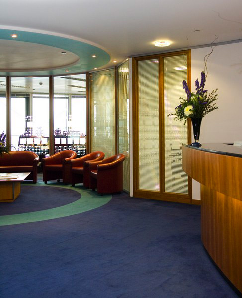
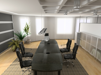
this design modern for office decorating is cool and elegant. when we a design we must see that design usefull for office can enjoys and convertable.

Contemporary Office Design

Contemporary Office Design
As the number one is that almost all at any time if there are affected by work in the contemporary office? If they, in most companies that it is with a lot of evidence that productivity is primarily interested in it. Although many people may be busy during the day, you will be with the amount of work that is actually lost due to improper design office
be surprised. In fact, this is something that should be considered because the little bit of extra design work in our contemporary office, we can increase productivity enough to design work pay, many times.

Contemporary Office Design
One thing to be taken into consideration when it comes to office design should be, related to type of storage contemporary office. If you are not a room available for storage or if you find that it quickly filled up, you might want some contemporary furniture storage, in the view that area or agency itself, there are many different pieces of furniture that can help you with your luggage and you can hide all files into other stationery. Take a look at some of the products, contemporary office design.

Contemporary Office Design
Believe it or not, another reason to keep in mind is to design office, because of productivity. This is especially true when it comes to storing contemporary office supplies and maintaining our comfortable coming. If you find that you are always looking for something in the supply room or when it will probably be chaotic, so fast they must be constantly cleaned, some possibilities for contemporary office storage, which will help you keep everything clean and in the hand.

Contemporary Office Design
Contemporary Office
Regardless of how your contemporary office is set, your sure a few pieces of contemporary office storage, to help you be more productive and enjoy find more deals. Ultimately, if you find your business happy and that you need more time during the day spend on it, then you begin, so you actually see it grow.

Contemporary Office
Contemporary Office
Design

Contemporary Office Design

Does A Beautiful Office Make You Think Better?

I'm certain no one could deny this. Imagine a place like this waiting for you every Monday morning:)

Office interior picture ideas

office interior design

cool office interior design


europe office interior

ventilation office interior design


home office interior design

Minimalist House Design and Simple


Minimalist House Design and Simple: Minimalist House Design

The Nothing Office


The Nothing OfficeNothing Office

With the help of Alrik Koundenburg and Joost van Bleiswikj, the Amsterdam based creative agency Nothing took the idea behind the company name (turning nothing into something) and applied it the design of company’s office.  Using a ‘no screw, no glue’ technique the office features walls, tables, shelves, beams, and even a staircase, all made from nothing but cardboard!

Red Bull Headquarters London

Red Bull Office HQ

There are few offices in the world that are as visually stunning and just plain fun looking as the Red Bull headquarters located in London.  The office was designed by Jump-Studios, and features everything from floating staircases, pin pong table meeting rooms, a sleek lounge area, and best of all a massive slide to transport you between meetings.  Some amazing pictures after the jump!

Red Bull Office Design
Red Bull HQ Office Design
Red Bull Headquarters Office Design

The Morris + King Company Office


Reception Area Office Design

Located in New York City, the Morris + King Company is a leading independent PR and marketing firm that recently finished a complete renovation of its offices, the results of which are nothing short of spectacular.  Under the direction of Judith R. King, partner and principal of The Morris + King Company, along with the help of David Aldaheff, a recognized leader of the avant-garde movement in furniture design and owner of The Future Perfect, the Morris + King offices were transformed into a vibrant workspace that is both functional, and fun.


Lite Brite Neon

The vision and theme of the redesign was a “glowing ice cube with hidden surprises”, which is perhaps the most visible in the “blue ice-cubicles”.  Fabricated by design firm Panelite, the cubicles contain dimmable stacked cube lamps, and desks with glass tabletops that reflect the tranquil blue hues from the cube walls.

Blue Ice Cubicle

The “rumpus room” is a stylish conference room that features an eclectic collection of blue chairs, including cast aluminum prototypes of 1970s Air France lounge chairs, velvet seats from the former cruise liner “Stella Solaris” and a pair of rocking chairs from Bensen.  The room also has a fully stocked back, a built in plasma tv, and even a Nintendo Wii system.

Rumpus Room

To accentuate the theme of the redesign the office was decorated with an inspiring collection of paintings, sculptures and photography, including 11 custom-designed abstract paintings that reside on the walls of the firm’s 40 foot gallery whose bold colors and sharp geometric shapes appear to be in a continuous state of motion.

Judith R Kings Office

Between its vibrant colors, stylized furniture and calming ambiance, the Morris + King Company office definitely looks like a great place to work!

Bears Cave Office by Paul Coudamy


bears cave office

The “Bears Cave” is a stunning interior office design project that was recently completed by French architect Paul Coudamy on behalf of Bearstech, an internet hosting company located in Paris.  The goal of the office design was to create a headquarters that communicated a feeling of strength by reflecting Bearstech’s innovative and wild approach to virtual technology.


bearstech bears cave office

The office is organized into three spaces, a working space, leisure space, and a meeting space.  The back room provides a mineral atmosphere with Parisan rock and brick walls, a stark contrast to the chaotic cavern walls of the front meeting room which were created with wood cut-offs rescued from sidewalks, dumpsters, and wasteland, the structure of which was intended to translate “the chaotic mass power dynamited in an uncontrolled energy: a wood vortex our of a natural disaster“.

bears cave office by paul coudamybears cave office design

A low honeycomb cardboard bench along with a vibrantly colored yet low-key bar area separates the meeting room and the working spaces, effectively creating circulation between the three spaces.


bears cave office designbears cave office designbears cave officebears cave office